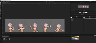
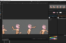
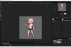
Trying my hand at pixel art.

samps

I laughed.
Community Guide
Joined
Dec 10, 2023
Messages
84
Reaction score
138
Good day,

I like to draw but have never tried pixel art before. In fact I haven't done much digital art at all.

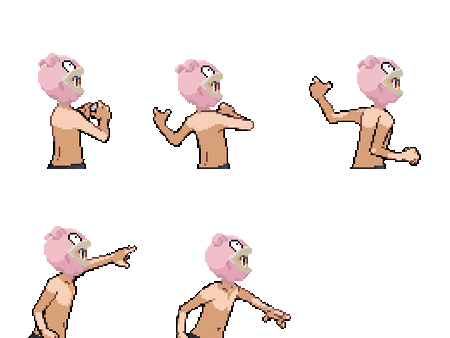
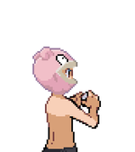
The recent contest inspired me to give it a shot. Here is what I have so far:
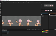
1703884491588.png

Let me know what you think and if there is anyway I can improve.

I'll try and update this thread as I move along. Thanks for reading.

~Samps
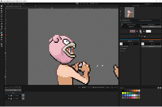
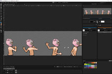
ani_bw_079.gif
 
1703887871701.png
added second ear. and adjusted as each frame goes. i think it gives it a little more depth
 
Your work is impressive, especially considering your lack of prior experience. I must say, if you ever find yourself at a creative block, I'd love to see your take on another Pokemon-inspired outfit, perhaps something inspired by Latios or Lucario? Your talent holds promise!
 
  • Like
Reactions: samps
Just adding the other ear is such an improvement, actually a really good idea
 
  • Like
Reactions: samps
Does slowpokes ears flop around??

1703891498127.png
 
While slowpokes ears prob dont flop this is a hat and floppy ears are cute. Here it is folks
slowpokemaleowv1.gifslowpokemalebackv1.gif
 
I think I'm gonna take a pause on this for now. I do want to tweak it a little bit. And I have an idea for it to give it a cool detail. But for now this little project was fun.

Thanks to everyone for the kind words. I will continue to tweak it based on suggestions
 
Last edited:
I don't know anything about pixel art but hear me out: have you tried contouring it, similarly to the body of the trainer, maybe in black or a darker shade of pink?

I think it's a few changes away from being great and I think it's impressive for your first work, good job!!
 
  • Like
Reactions: samps
I don't know anything about pixel art but hear me out: have you tried contouring it, similarly to the body of the trainer, maybe in black or a darker shade of pink?

I think it's a few changes away from being great and I think it's impressive for your first work, good job!!
Are you talking about the border around the trainer? And putting something like that on the slowpoke hat to kinda pop it out a bit?
 
I don't know anything about pixel art but hear me out: have you tried contouring it, similarly to the body of the trainer, maybe in black or a darker shade of pink?

I think it's a few changes away from being great and I think it's impressive for your first work, good job!!
1703909436241.png
Is this a little closer to what you had in mind?
 
Are you talking about the border around the trainer? And putting something like that on the slowpoke hat to kinda pop it out a bit?
Ya like around the mask!!
This is really bad and just to give you an idea (I'm in bed so I had to do this on my phone and it's really hard, sorry!)

I only used one color but I think more than one shade should be used (lighter on the top left probably to keep the shading consistent) and the color itself isn't the best either so you can play with that! I'd like to try and give it a fair shot tomorrow when I have access to my pc ^^

Is this a little closer to what you had in mind?

Yeah!! Like I said I think the top left part needs to be lighter and probably the contour around the mouth of a different color as well? It's gonna be hard to say for sure until I can try it out and see what looks right and wrong but I think you're on the right path!
 

Attachments

  • Content.png
    Content.png
    5.6 KB · Views: 3
Last edited:
  • Like
Reactions: Drunk and samps
Ya like around the mask!!
This is really bad and just to give you an idea (I'm in bed so I had to do this on my phone and it's really hard, sorry!)

I only used one color but I think more than one shade should be used (lighter on the top left probably to keep the shading consistent) and the color itself isn't the best either so you can play with that! I'd like to try and give it a fair shot tomorrow when I have access to my pc ^^


Yeah!! Like I said I think the top left part needs to be lighter and probably the contour around the mouth of a different color as well? It's gonna be hard to say for sure until I can try it out and see what looks right and wrong but I think you're on the right path!
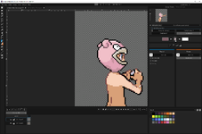
Heres my wip for the contouring. I also did a little more shading. Let me know what you think.

1703958385403.png
 
Appearing nice, although the border around the mouth seems a bit intense. Perhaps consider switching the color to a darker shade of pink or brown?
I will definitely try this later. I agree with you too as I was thinking his mouth was off
 
Really nice work so far, can't wait to see what else you cook <3
 
  • Like
Reactions: samps
Appearing nice, although the border around the mouth seems a bit intense. Perhaps consider switching the color to a darker shade of pink or brown?
after messing around with it a bit more

1704062514677.png


Before and after v2

slowpokemalebackv1.1.gifslowpokemalebackv1.2.gif
 
  • Like
Reactions: Maid Lulia
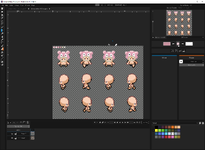
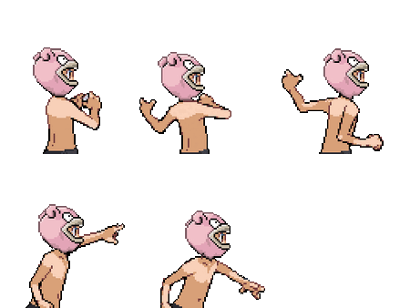
first attempt at the front image. harder than i thought. what do you think?

1704066672063.png